Designing a data product around an executive’s inquisitive moments.
After a large-scale migration of the internal dashboards I'd designed for the product, finance, marketing, sales, and executive teams, the Director of Data & Analytics asked me to explore how the same data could be made available to VP and C-level leaders on mobile devices.
I set the brief, product requirements, interaction model, and mobile designs. The concept was presented to the C-suite and used to evaluate cost and feasibility.
Deciding what to build:
Rather than treating it as a mobile version of our existing dashboards, I explored when and why an executive might need to access data.
Three exploratory scenarios shifted the focus from mobile dashboards to three purpose-built surfaces:
- 5-10-minute windows during the day → Reports
- Quick checks during meetings → Numbers
- Exploratory deep dives when time allows → Analysis
Designing ‘Analysis’:
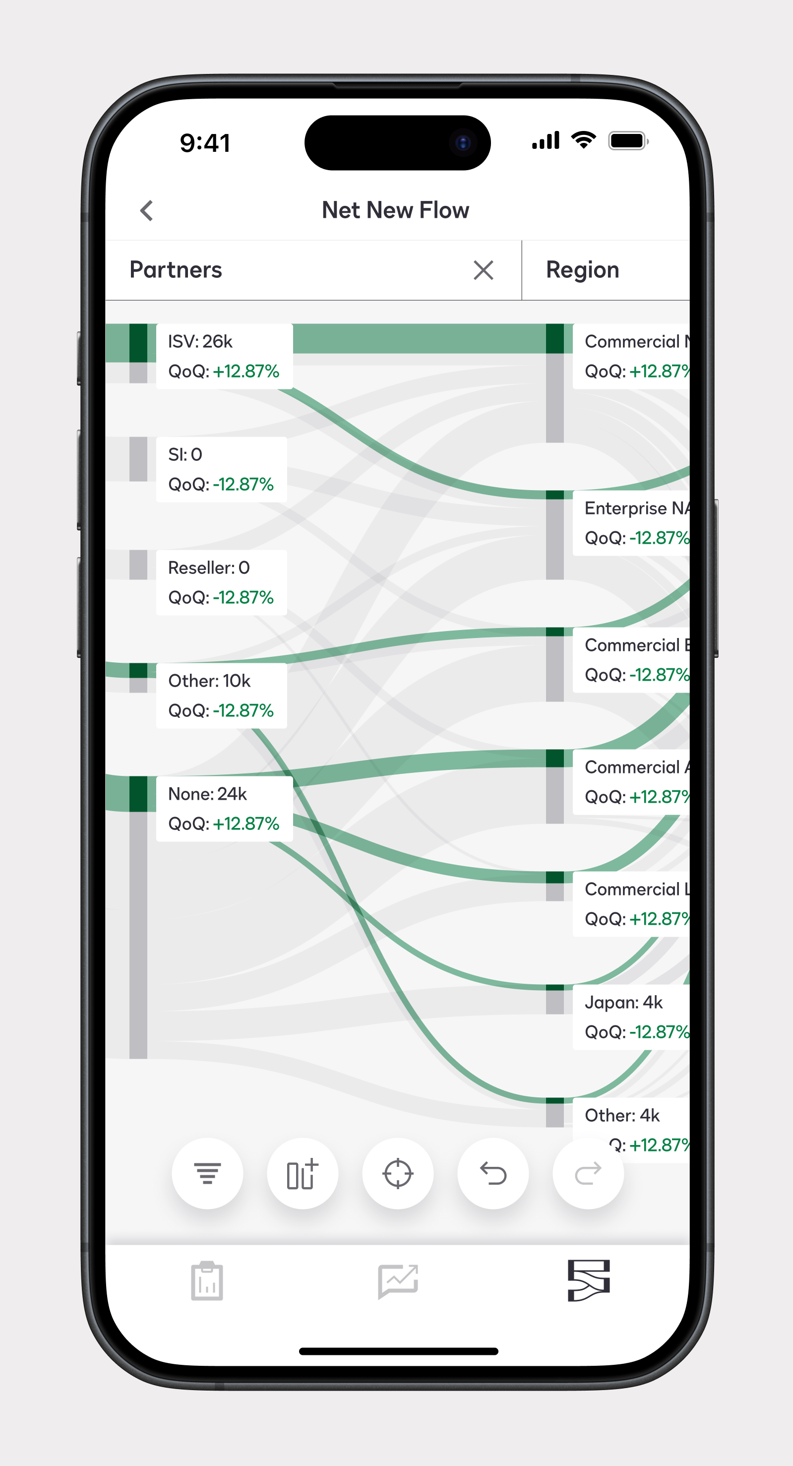
Reviewing dashboards across departments showed that the same business unit could be a metric, dimension, or filter depending on the team. I needed one analytical layer that supported all three roles.
I designed Analysis as a Sankey flow that let users trace a metric through partners, regions, products, channels, and customers.
The Focus and Filters controls operated on the same dataset and its subsets.
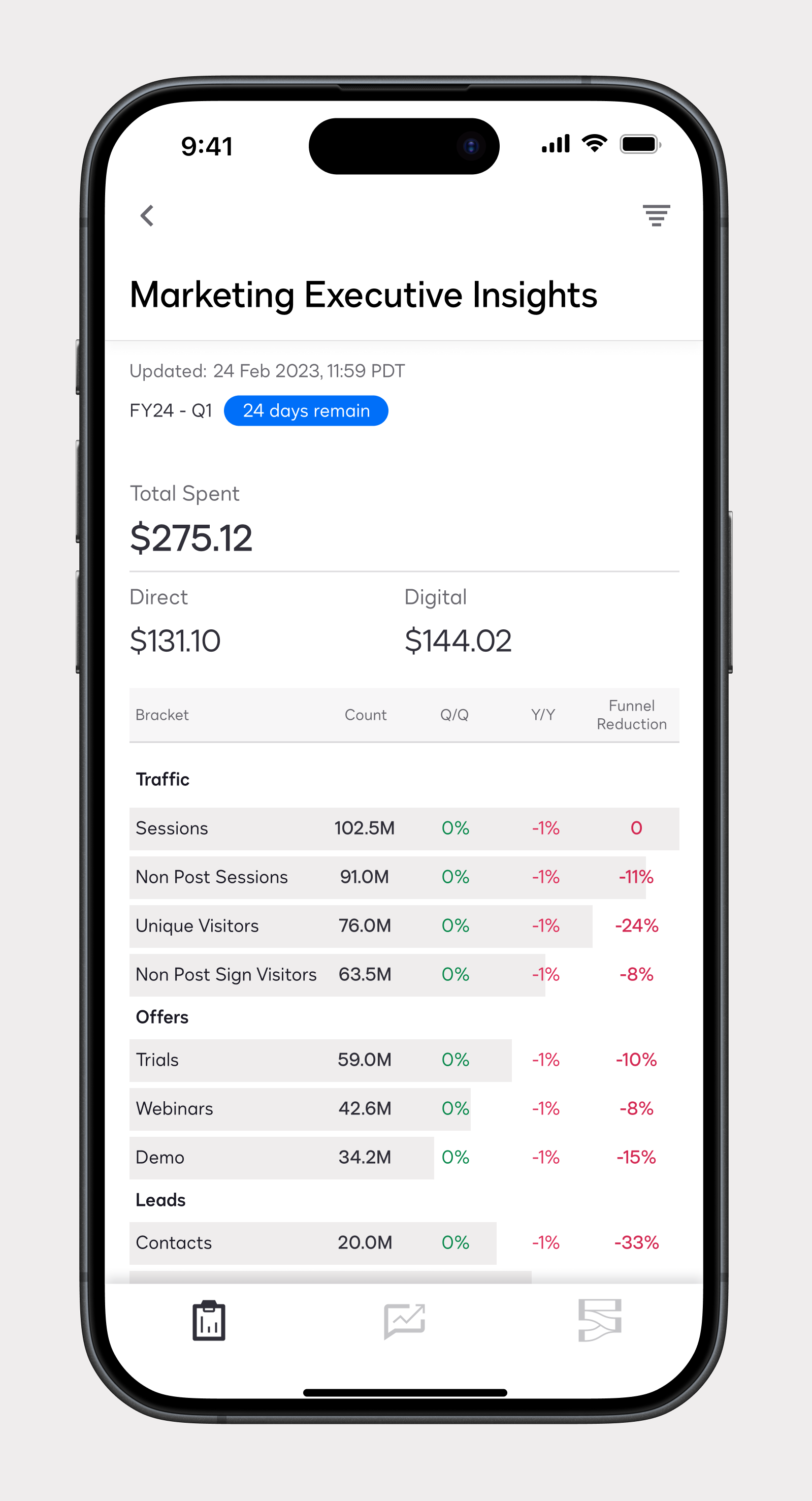
Designing ‘Reports’:
Internal reports were already dense on desktop, so moving them to mobile required a clearer hierarchy.
I designed Reports as a fixed, card-based layout inspired by elements of a digital news report, using sheets to reveal detail progressively and visuals to clarify dense datasets. This preserved access to every metric without overwhelming executives.
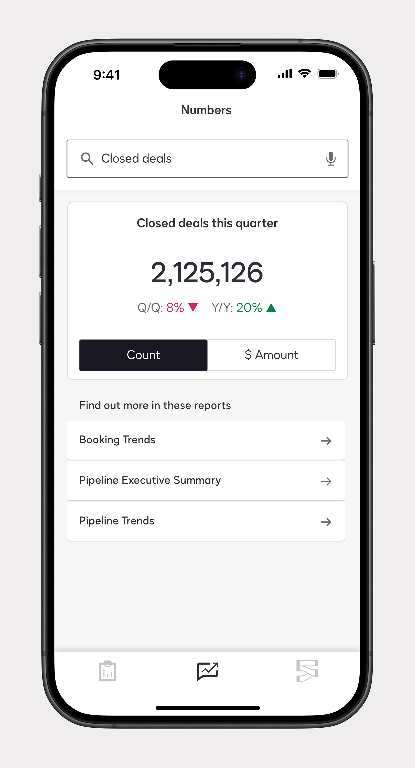
Designing ‘Numbers’:
This surface centered on helping a user find a metric during a call, making time-to-value critical.
I used a search bar rather than a chat box to signal that short phrases were enough—a behavior validated in prototype testing with directors. Although the interface suggested sophisticated AI, the result could be delivered without LLMs using lower-cost NLP frameworks. That path enabled the project to move into cost estimation.
Outcome and takeaway:
The application was tested with five chiefs of staff who acted as proxies for the C-suite and was later demoed to DocuSign's C-suite directly.
It then went through a cost-estimation cycle and was subsequently shelved alongside several other company-wide initiatives as part of budget cuts following DocuSign's acquisition of Lexicon.
Despite being a speculative initiative, the application resonated with executives because it was designed around moments in the life cycle of an executive rather than as a mobile version of existing reporting infrastructure.